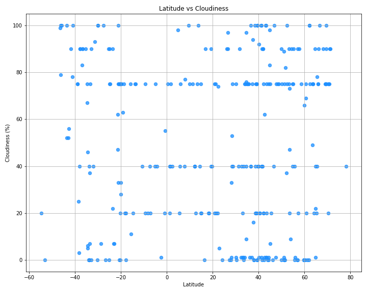
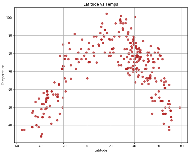
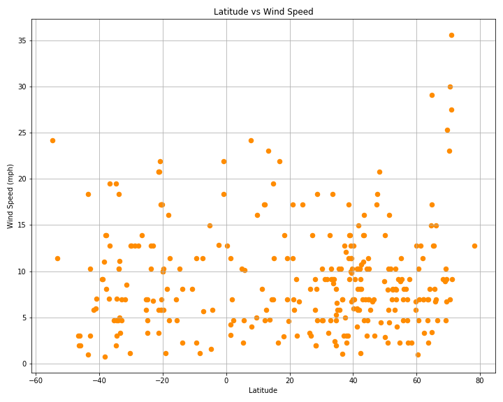
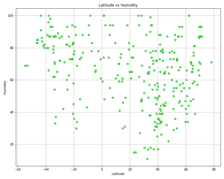
Weather Data vs. Latitude

Side by side comparison of humidity, wind speed, temperature and cloudiness:

For all scatter plot illustrations, the equator correlates with "0" on the x axis line. The strongest correlation is likely expected in the graph Latitude vs. Temperatures which shows that it is hottest close to the equator.
cloudiness
temps
windspeed
humidity

Observations on latitude:

Perhaps of interest is the fact that most of the world's population and landmass is in the northern hemisphere. Since the temperature readings come from cities the data does not reflect what may be happening in unpopulated areas. The "Latitude vs. Windspeed" graph shows some spikes near the North and South Poles.